John le Carré: A Legacy of Spies
Cover Design
In April 2017 I was approached by the digital production company The Ink Factory and digital agency TH_NK to create a cover design for British espionage author, John le Carré. It featured his latest George Smiley novel, A Legacy of Spies.
While the cover designs didn't make the final
cut, I wanted to share the process and proposed designs from this great opportunity. Art direction provided by Phil Wilce (TH_NK) and Callum Dodgson (The Ink Factory).
As embarrassing as it was to admit, the extent of my John le Carré knowledge started and ended with
the Tinker Tailor Soldier Spy film. This drove me to dig deep into his author history and research what had been done for his books design over the past 30 years. This included patterns, common themes and cliches I may have wanted to avoid.
Research
Research into John le Carré books
The idea of rough, 3-dimensional type struck me as a strong direction to pursue for a big trade
book of this nature. The household name would be immediately recognizable as long as it was
paired with minimal illustrative intrusion.
Part of my moodboard for A Legacy of Spies
Proposed Cover Directions
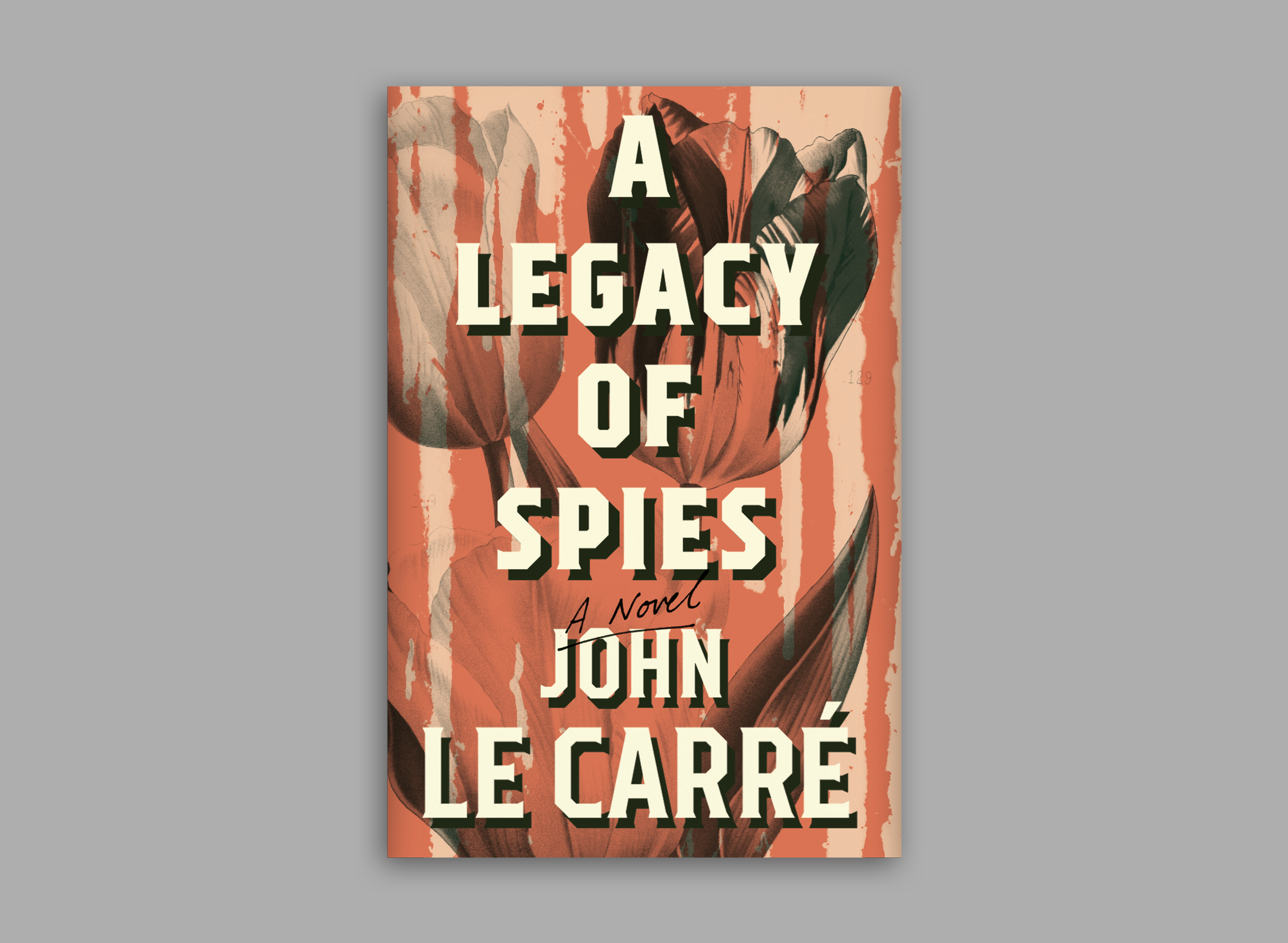
The first direction features one of the main themes of the book, a tulip. The split levels of the tulip above ground and what was (literally) underneath represented many of the common, contradictory themes in George Smiley's life and A Legacy of Spies.
The second direction was simple and bold, keeping it minimal with a subtle grunge along the edges. The color palette evoked of a sense of the past while the contemporary typeface treatment helped bring it to the present.
The final direction uses the same type treatment as the previous cover but is paired with a stronger visual element to create some tension and sense of dimension. Like the first direction, the cover incorporates the tulip motif but instead of a contemporary photograph, it utilizes a vintage botany illustration, echoing more to the past and the attempt to cover it up.


